Project: Toco Grill Branding Revamp
Objective: The aim of this project was to rejuvenate the branding for Toco Grill, a unique kosher fast-casual restaurant offering an intriguing fusion of Middle Eastern and American cuisine. The new owner, inspired by the potential to shape the future direction of the restaurant, sought to breathe new life into the restaurant's identity. He wanted to maintain the essence of the existing logo but infuse it with high-contrast colors and a more modern appeal to better reflect his personality and the innovative culinary approach of Toco Grill.
Process: The process began with a thorough analysis of the existing branding and logo, understanding its strengths and the elements that were in line with the owner's vision. Based on this analysis, we decided to retain the logo's structure while overhauling its colors, layout, and overall vibe. We opted for bold, bright colors set against a dark background, reflecting the desired high-contrast, modern look. I worked closely with the client through multiple iterations, ensuring each change was aligned with their vision.
Outcome: The outcome was a successful brand revamp that stayed true to Toco Grill's roots while injecting fresh, modern energy into its identity. The new branding, characterized by striking colors and a streamlined layout, captured the owner's personality and the future-facing direction of the restaurant. The high-contrast, modern look proved appealing to both existing patrons and a new demographic, helping to invigorate the restaurant's customer base. It was not just a design overhaul but a reinvention of the Toco Grill's visual narrative, adding depth and dynamism to its story.
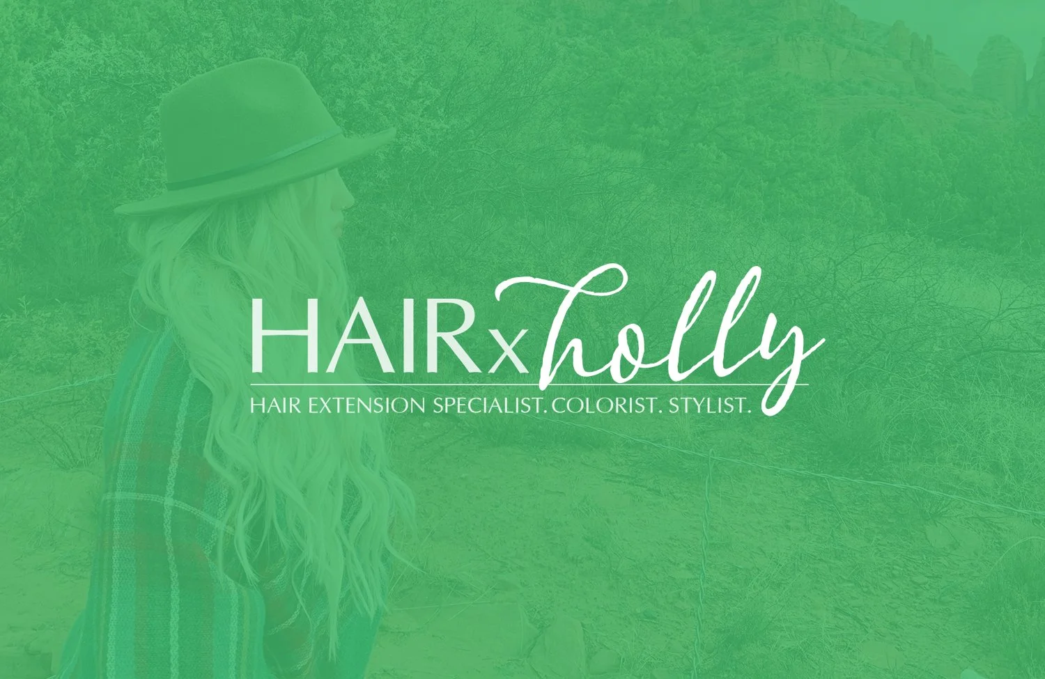
Project: HairxHolly - Transforming a Dream into a Successful Business Venture
Programs Used: Adobe InDesign, Adobe Illustrator, Adobe Photoshop
Objective: The primary goal of this project was to assist Holly, a talented hairdresser, in her transition from working in a salon to establishing her own Salon Lofts. She required support in the crucial areas of marketing and branding. The task was to develop a website, curate a robust social media presence, and design business cards that could double as appointment reminders.
Process: I worked closely with Holly to create a website that would act as her digital storefront, showcasing critical information such as her services, pricing, location, and contact details. The design incorporated a dominant green color, mirroring Holly's personal preference and vibrant personality. In fact, Holly's affinity for the color green extends to all facets of her life, even her car. This personal touch added a unique element to the branding, making it truly a reflection of Holly. The aim was to make the website not only visually appealing but also easy to navigate, offering all the necessary information to potential clients at their fingertips.
Parallel to this, we embarked on a journey to build a compelling Instagram presence. I advised Holly on her social media posts, helping her understand the nuances of engagement, consistency, and content aesthetics. We kept the green theme consistent across the digital platforms for a unified brand identity. To complete the branding loop, we designed a business card in her signature green that not only served as a traditional contact piece but could also function as an appointment reminder.
Outcome: The outcome of our collaboration was a thriving business for Holly. The website and social media initiatives have helped her establish a solid online presence, effectively reaching clients from all over the country who are attracted by her rare extension skills. Today, Holly is so sought-after that her schedule is booked six weeks in advance. This project demonstrated the power of effective branding and digital marketing in turning an entrepreneur's dream into a flourishing reality. Visit www.hairbyholly.com to see the transformation.
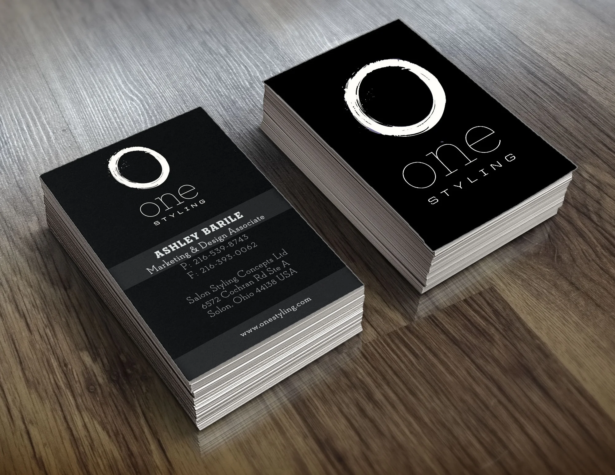
Project: ONE Styling Brand and Website Makeover
Programs Used: Adobe InDesign, Adobe Illustrator, Adobe Photoshop
Objective: The task at ONE Styling was to breathe new life into the brand by undertaking a comprehensive branding makeover, leaning towards a minimalist, sophisticated aesthetic. The objective was to craft a brand identity that mirrored the luxury appeal of brands such as Chanel, while staying true to ONE Styling's color scheme of black and white. Parallel to the branding overhaul, a website redesign was in order, focusing on a user-friendly interface that still upheld the minimalist ethos of the brand.
Process: After conducting thorough research and analysis of luxury brands, the design process commenced with a commitment to simplicity and elegance. A clean, minimalistic design was developed, emphasizing sophistication and the premium quality of the brand's offerings. In tandem with this, I coordinated with an external vendor for the website redesign, focusing on usability while maintaining the minimalist aesthetic. We prioritized a simple monochrome color scheme to ensure the primary focus remained on ONE Styling's hair tools.
Outcome: The outcome was a successful transformation of ONE Styling's brand identity. The new brand image captured the sophisticated simplicity we sought, strongly resonating with our target audience. The website redesign was equally successful, achieving a balance of minimalist design and functional ease. The renewed focus on simple functionality and elegant design was reflected across all marketing materials, leading to a coherent and visually appealing brand experience. This rebranding process played a key role in enhancing ONE Styling's market presence and customer perception.
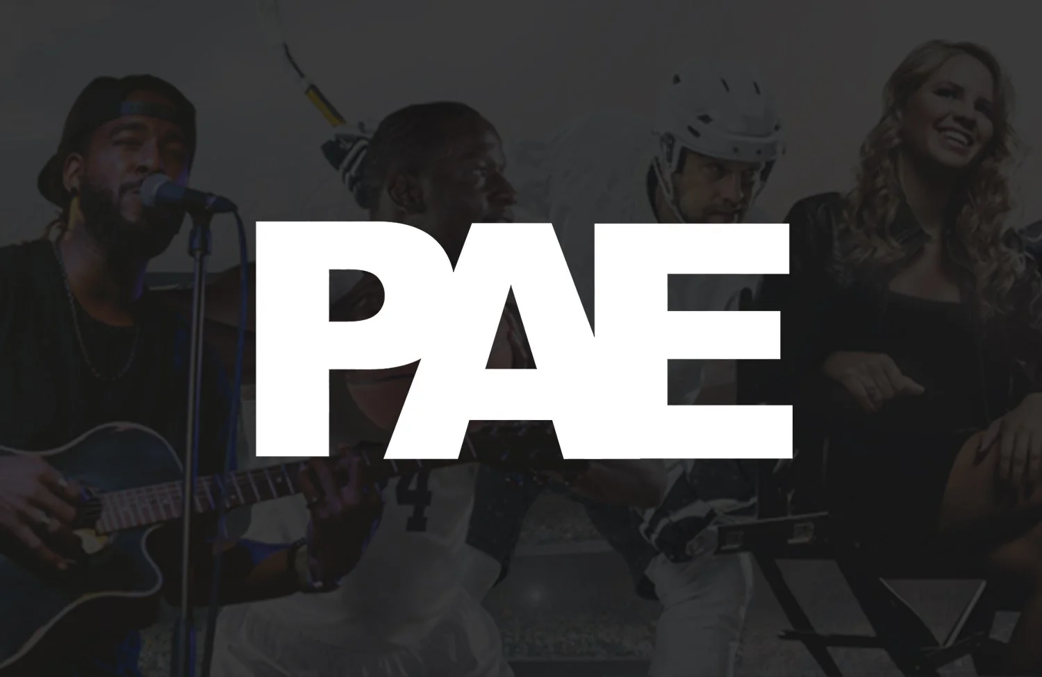
Project: PAE (Professional Athletes & Entertainers) - Brand Refresh and Logo Redesign
Programs Used: Adobe InDesign, Adobe Photoshop, Adobe Illustrator
Objective: The goal of the project was to rejuvenate the logo and overall branding of PAE, a company renowned in the sports and entertainment industry, following its acquisition. The new branding was to strike a balance between being recognizably connected to its roots and reflecting a more modern, dynamic aesthetic. Bold and striking colors were essential to capture the spirited energy of the sports genre and cater to the company's clientele.
Process: In close collaboration with the head of the company, we embarked on a journey to refresh the brand while retaining its core identity. Given the logo's industry recognition, we chose not to stray too far from the original design but to instead add elements that would give it a modern appeal. We used dramatic and robust colors to breathe life into the logo, subtly reshaping it to reflect a more contemporary, dynamic feel.
A suite of marketing materials was designed using the new branding, keeping in mind the company's rich heritage and forward-looking approach. These assets were all carefully crafted to align with the refreshed brand ethos, creating a unified, distinctive identity across all touchpoints.
Outcome: The rebranding of PAE was successful, leading to a refreshed and invigorated visual identity for the company that was both modern and resonant of its established reputation. The use of bold colors and subtle tweaks to the original logo created a brand image that was contemporary, dynamic, and fitting to the exciting world of professional athletes and entertainers. The new branding was well-received, reinforcing PAE's strong presence in the industry while ushering in a new era of growth and dynamism for the company.
Project: The Charmed Heart - Personalized Wedding Invitations and Save-the-Dates
Programs Used: Adobe Photoshop, Adobe Illustrator, Adobe InDesign
Objective: The Charmed Heart was born out of a passion for designing bespoke wedding invitations and save-the-date cards. The primary goal was to provide couples with designs that were not only visually appealing but also truly reflective of their personality and wedding theme. As each couple and their love story is unique, it was essential that the design process was personalized and tailored to their individual needs and preferences.
Process: Each project, though unique in its essence, followed a consistent process to ensure the delivery of a product that truly represented each couple's vision. The process began with an in-depth discussion to understand the couple's theme, personal style, and their vision for the event. This information served as the basis for creating a unique, hand-painted illustrated design. Working hand-in-hand with each client, several iterations were made to ensure each element of the design was aligned with the couple's expectations, leading to the final product that was as unique and special as their love story.
Outcome: The Charmed Heart successfully carved out a niche in the wedding invitation business, known for its personalized, hand-painted designs. Each project not only resulted in beautifully crafted invitations and save-the-dates but also a unique keepsake for the couple. Through this venture, I was able to help numerous couples bring their wedding vision to life, one invitation at a time, contributing to the joy and celebration of their special day.
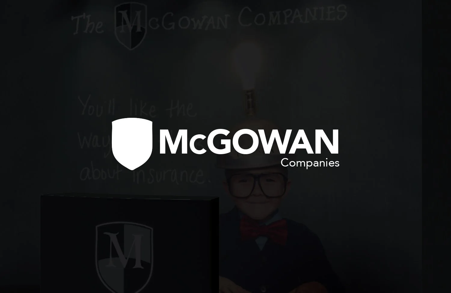
Project: The McGowan Companies - Ongoing Brand Consistency and New Acquisitions Branding
Programs Used: Adobe InDesign, Adobe Photoshop, Adobe Illustrator, Sketch
Objective: As part of my ongoing role at The McGowan Companies, I'm tasked with maintaining and enhancing the visual identity of numerous existing companies within the McGowan portfolio. Additionally, a key part of my role is to establish and develop the branding for newly acquired companies. I create an array of marketing materials, including magazine ad campaigns, trade show displays, marketing kits, eblasts, and flyers. The challenge lies in giving each company its unique persona and brand colors, while ensuring a consistent overarching brand identity.
Process: I oversee continuous design work across multiple platforms for all McGowan companies, both existing and newly acquired. For each newly acquired company, I initiate the process by understanding their market position, values, and target audience. This foundational knowledge allows me to create a unique yet coherent brand identity that aligns with the overarching McGowan brand guidelines.
For the existing companies, my focus is on enhancing their current branding and ensuring that all their marketing materials reflect their individual identities, while maintaining a consistent design language with the parent brand.
The balance between individuality and consistency is carefully managed by adhering to each company's unique brand colors and style, while incorporating elements that tie them back to the central McGowan brand.
Outcome: This continual process has resulted in a portfolio where each company, both existing and newly incorporated, has a distinct yet cohesive brand identity. As a result, The McGowan Companies' portfolio is a tapestry of unique identities woven together with the consistent threads of shared values and a unified brand language. This approach to design has not only strengthened the brand identity of each individual company but also enhanced the collective brand strength of The McGowan Companies as a whole, regardless of the constant evolution and growth of the portfolio.